You may have seen that Pantone release the 2015 Colour of the Year last week. It's called Marsala and was a bit of a surprise, I think. You can read Pantone's take on it and see their pretty pictures here.
The above is the official swatch from Pantone's website. Below, I created a couple of samples using the CMYK and RGB values that Pantone provide. Interestingly, the colours turned out quite different depending on whether I used the CMYK or RGB values - CMYK is on the left and RGB is on the right. I'm sure someone who knows more about colours can explain why!
Marsala has not been getting a lot of love, from what I can tell. I have to agree that it's not necessarily an immediately appealing colour (and I found this article, which you should not read if you are even vaguely easily offended, quite amusing). That said, I think Marsala has a lot of potential, especially if you are willing to apply a reasonably liberal interpretation of what fabrics are Marsala coloured...
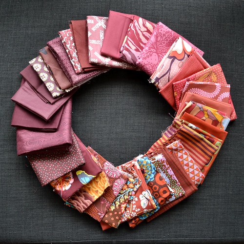
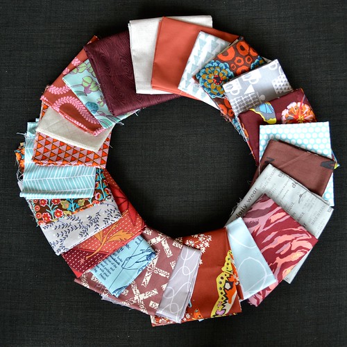
After raiding my stash and my friend Anne's stash, this is the pull of fabrics I came up with for Marsala. You can see I've used the actual colour as a starting point and pushed my choices out into the more purple shades and the more orange shades to cover quite a range of warm red/browns.
I've numbered my picks, but you'll have to forgive me because pulling from stash means I don't necessarily know what all these fabrics are!
Starting with the purple solid at the top and working clockwise, they are 1. Unknown solid, 2. Anna Maria Horner - Innocent Crush - Turn of Events in Plum, 3. Anna Maria Horner - Good Folks - Filigree in Plum, 4. Kathy Doughty - A Wandering Mind - Flowering Vine in Rose, 5. Kathy Doughty - A Wandering Mind - Scribble Strip in Rust, 6. Kathy Doughty - A Wandering Mind - Flowering Vine in Rust, 7. Tula Pink - Fox Field - Serpentine in Sunrise, 8. Kona Cotton in Sienna, 9. Unknown Kaffe Fassett, 10. Kona Cotton in Paprika, 11. Unknown, 12. Kaffe Fassett stripe, 13. Anna Maria Horner - Pretty Potent - Family Unit in Cherry, 14. Unknown, 15. Anna Maria Horner - Honor Roll - Balancing Act in Carmel, 16. Unknown Kaffe Fassett, 17. Amy Butler - Alchemy - Queen Ann's Butterflies in Ruby, 18. Kaffe Fassett - Persian Vase in Brown, 19. Anna Maria Horner - Field Study - Specimen in Raspberry, 20. Unknown Kaffe Fassett, 21. Anna Maria Horner - Loulouthi - Clippings in Glow, 22. Denyse Schmidt - Flea Market Fancy (reprint) - Fizzy Dot in Red, 23. Juliana Horner, 24. Unknown solid, 25. Unknown solid, 26. Unknown solid, 27. Art Gallery Fabrics - Modernology, 28. Suzuko Koseki - Postmodern in Brown, 29. Nancy Gere - Fredricksburg C. 1895, 30. Unknown scrap, 31. Lecien - Eternal Graduation, 32. Alison Glass - X and Plus in Adobe.
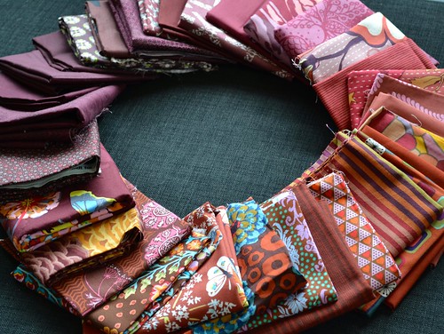
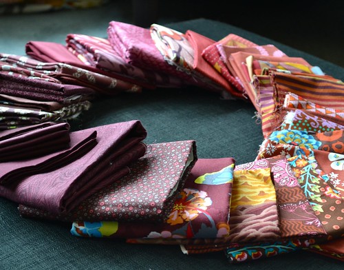
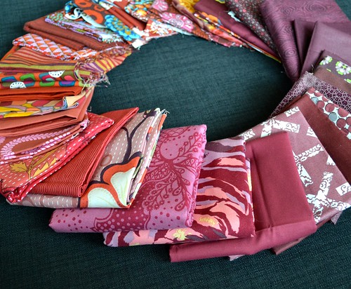
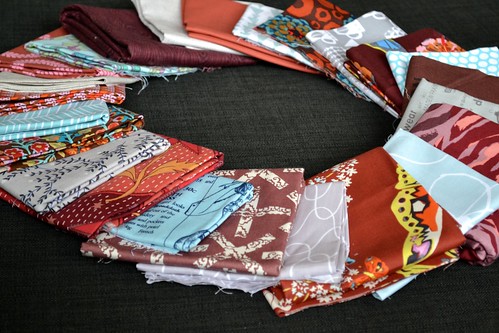
Here are some closer shots of the different coloured sections.
There are a lot of really nice fabrics in here. I spied a few fabrics at a local quilt shop that were pretty close in colour to Marsala but a bit blah - I left them on the shelf because I decided I had enough really nice ones instead.
The colour combination that sprang immediately to mind when I saw Marsala was adding in some icy silver grey and cool blue/aqua for a crisp and kind of retro feeling.
I'm pretty happy with this quick pull, created by adding some of my Marsala picks to greys and pale blues pulled from stash. I definitely think it takes Marsala to a place that's a bit more fresh and modern.
Anyway, however you feel about Marsala, I hope that's given you something to think about. If you're looking for some more inspiration, Latifah Saafir of Latifah Saafir Studios did a great post about why she loves the Pantone Colour of the Year. My 2014 Pantone Colour of the Year Quilt Challenge co-host Anne from Play Crafts has also posted about Marsala and I really love the different palettes she came up with.
Speaking of the Pantone Colour of the Year Challenge, Anne from Play Crafts and I will be co-hosting a challenge again in 2015, and we will have more details for you soon!
So, what do you think? Love it, hate it, think it could grow on you?


23 comments:
Hi Adrianne - I love it :) Right out of my comfort zone but I love your take on adding the cool tones of silver and blue. It is way more challenging than last year's colour and I think we all love a challenge:)
I'm always up for a challenge and while it's not a color I would choose immediately, that doesn't mean it is a bad one.
Looking forward to the Pantone Challenge next year and all that it entails.
I like it! I think it's nice to have something other than a fire engine red. :)
Red is just not my color, so I don't love it, but I do really like the pulls you and others have done working with it. I could see it making some really inspiring and beautiful challenge quilts. :)
It was a surprise at first, I was expecting aqua or even grey to win, but I don't mind Marsala. It's great to see your fabric play using the colour as inspiration.
The up side for me is that it's one less project that I feel compelled to add to my 2015 list. I'll be giving this one a miss. I don't own any of the fabrics you've shown in this post, or even anything similar. I'll continue to play with my blues, greens and purples, and wait for the pendulum to swing back in my direction in 2016. I'm sure you'll manage to conjure up something amazing and make me view marsala in a different light.
Love it! But then what do you expect from a girl who names her blog redquilts lol my living room is this color and has been for 8 years, guess I was in vogue a mite early lol
I'd totally would make a quilt with the fabrics you've chosen. Part of what's so much fun for me in quilting is challenging myself to try new colors, styles and techniques so there's nothing I would reject right away - except making the same pattern twice.
The link you includes is fairly harmless compared to this one: http://www.mollisparkles.com/2014/12/marsala-erotica.html
I couldn't stop laughing when I read it.
I saw the announcement last week and was a little surprised about it. However, I was inspired to have my toenails done in Marsala...:-) It's all right I guess.
And honestly, I like it better then Radiant Orchid.
I love your Marsala fabric pull.
I forgot to comment re the difference between the RGB and the CMYK swatches. Which software did you use? I entered the values in Adobe Illustrator and they're indistinguishable and that's how they ought to be since this is a color which is well within the CMYK range.
Lol, I see what you mean about being easily offended. Fortunately I'm not.
I just love your pull! I think it really makes the colors shine. :)
Now that is an interesting color! I can work with that! Very nice and different!
I like your stash pull - I'm thinking its an interesting colour and I'll check my stash to see if I can find some fabrics ! Looking forward to your challenge !
This burgundy wine colour is not for me. Was not when it was in style last time too. It is lovely in a glass, but for me, that's all.
All I see is brown and I am not friends with brown. Yes, i know that some of those fabrics are from my stash and you did add in some grey, but it hasn't grown on me yet.
Although I do have a Rosalie Dace class coming up and all the class samples look brown and I do like a challenge.
Thanks in advance for you and other Anne hosting the pantone challenge :-)
Thanks for putting this post together! I feel a lot better about the color after seeing your combinations. I'm going to refer to this when I challenge my guild to make something with Marsala... thanks!
I think it looks great with duck egg blue and cream. The RGB colours are for screen view, CMYK is more accurate for printing output. Something to do with spot colours and process colours.... Pantones are different depending on the library used for different applications too, it's a minefield.
I thought the emerald green was bad enough, year before last, but ick!! Guessing public toilet floor tiles deserve to be 'on trend' once in their lives ;)
You have made the best of a bad bunch!
I thought the emerald green was bad enough, year before last, but ick!! Guessing public toilet floor tiles deserve to be 'on trend' once in their lives ;)
You have made the best of a bad bunch!
I am a little surprised with how much people hate this color. Especially because this color, or similar ones, are in some of the collections that people seem to love (Maureen Cracknell's new collection and some of Juliana Horner's prints). I love purple and I am a pretty big fan of brown, so I actually like this color quite a bit.
You have three of my VERY favorite fabrics in there -- the FMF fizzy dots, the Juliana Horner woodgrain, and the AMH specimen from Field Study. So maybe I like this color after all.
i do love this color, there are so very many places to take it. Thanks for posting some pic's between them and comparing in my stash i've found some pretty good pieces, mostly AMH and Kaffe, they know color really well so i'm going to follow their color schemes. And also this lovely glass of Port i'm enjoying at the moment. lol Actually having a small amount of Port in a crystal glass gives me a very clear (no pun intended) picture of the color. though mostly based off of AMH innocent crush. Love a good challenge to start off the New Year
Post a Comment